What Howie wants from me is a cool image that will be our main menu picture or background thing, whatever you want to call it.
So I started to make the background and ran into a few problems, first my sprites where too small for the actual background, so I needed to scale them to fit it properly. My second problem was when I scaled them it made them look like blurry garbage. So this took me awhile to figure out what setting in my Paint program was doing this. It was actually extremely simple to figure out. Turns out it was just a quality setting trying to make my picture look good, but because it is only a tiny little sprite, the only thing it achieved was making it look uglier then sin.
"Best Quality" - Made it and ugly blurry.
"Nearest Neighbor" - Made it look perfect.


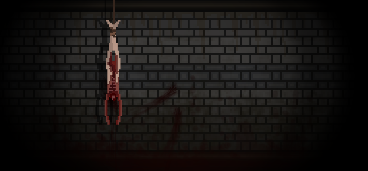
I then proceeded to create the background with the proper sized sprites, I decided to use a older blog post to help me make a wall texture for this background. The post I am referring to was on "Subway Walls". I thought the walls would make a perfect backdrop for our new main menu.
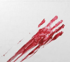
I then did some gruesome google searches of blood stain pictures (Wouldn't Recommend). Basically trying to find some inspiration for nasty things I can smear on the walls of this background... And I found one that was pretty good. Sadly, its a little cliche, but what can you do? Cliche things are Cliche for a reason.
 Now I have completed a version of the background, it looks pretty good. But I want to animate it to make it feel more alive. I might do that another day or maybe even later today, I haven't really decided. Another thing to note with this background is the shadow, which isn't something I would normally add. But I wanted to try something new. It was actually a pretty simple little trick, I just copied the hanging corpse and made it completely black. Then I took that image, put it on a layer behind the original, changed the opacity, and shifted it to the left. It was an extremely effective easy method for pixel art. It also adds a great deal of depth to the image.
Not saying its the most complicated thing to learn, but hey! It works!
Tomorrow I will work on this background, and if not that maybe I will start another overwhelming animation.
No comments:
Post a Comment